Product Packaging Design
I have over a decade of experience designing for the CPG industry both in-house, at agencies and freelance.
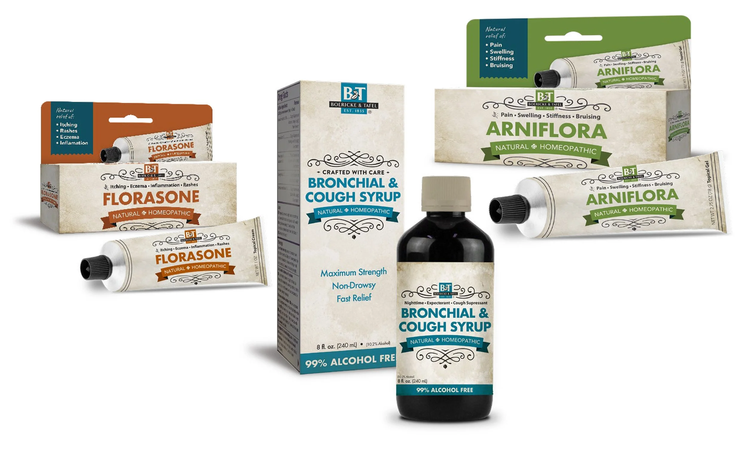
This is one of the world’s oldest homeopathic brands and so the goal with these concepts was to revitalize the look and feel with a “modern vintage” look that spoke to the heritage of this storied and respected brand while also giving it a modern refresh.
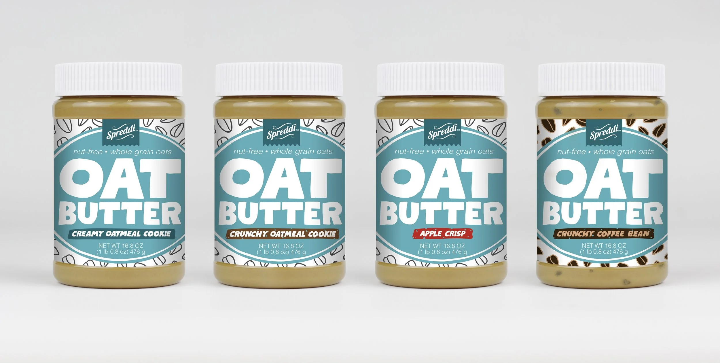
For this peanut butter alternative brand, I designed the logo as well as packaging. The goal of these designs were to immediately distinguish it as a peanut butter alternative both with a large typeface proclaiming its oat ingredients as well as employing a fun visual pattern representation. Care was also given to select a color palette that would easily differentiate from competitors on the shelf.
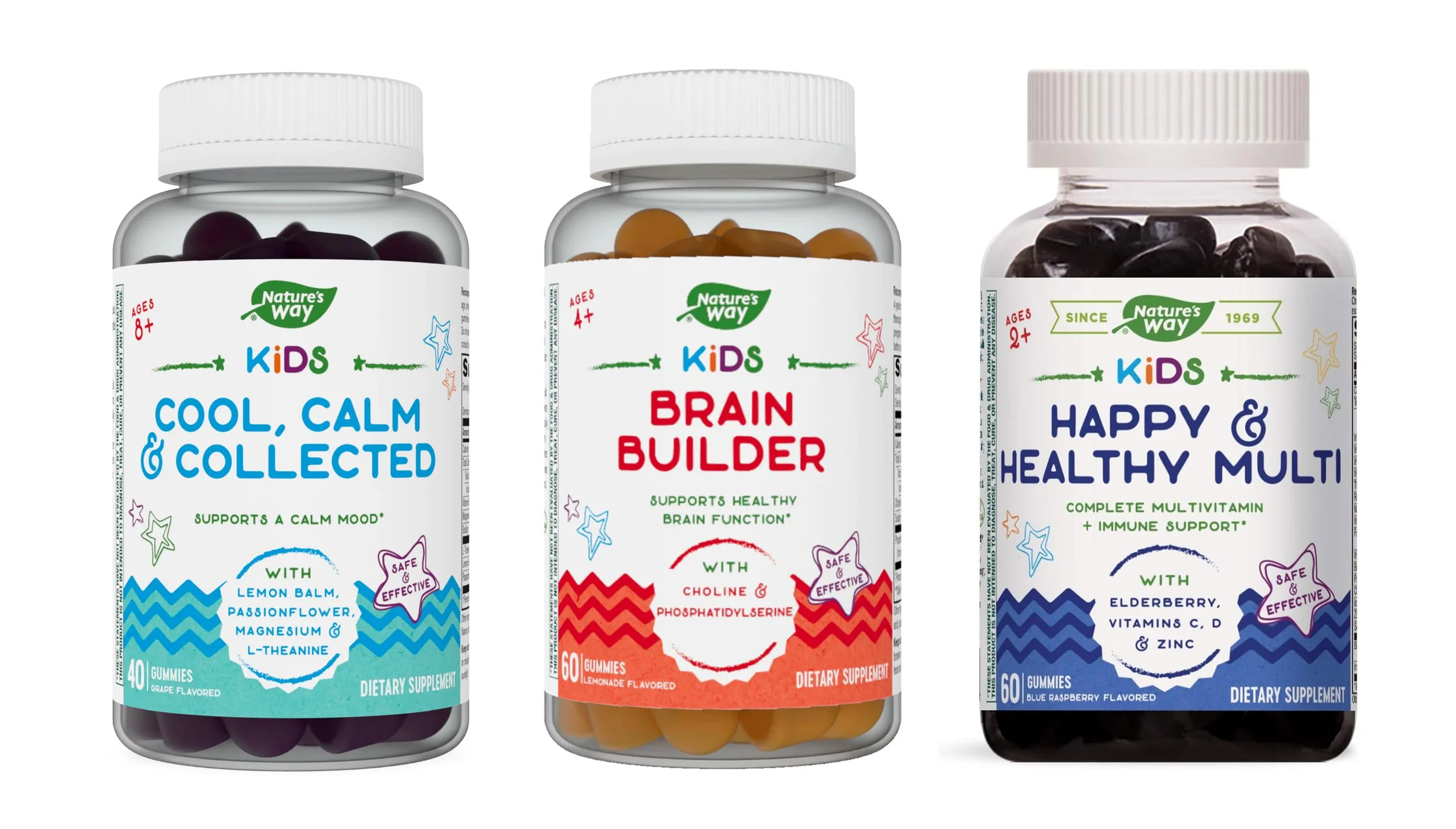
For this new kids gummies product line, I wanted to create a fun and quickly differentiated product set using bright colors, fun patterns as well as shapes that invoked a sense of action all while keeping a minimalist information architecture that kept key product points instantly discernible.


